User Experience
Evaluate and optimize your user interfaces, workflows, and digital experiences using AI personas before launch. This synthetic research approach reveals usability issues, validates design decisions, and helps you understand how different user types interact with your product without the cost and complexity of traditional usability testing with real participants.
What is it Used For?
User Experience Research evaluates how people interact with digital products, interfaces, and workflows to identify usability issues and optimization opportunities before launch or redesign. This methodology helps businesses validate design decisions by testing user interfaces with diverse user types and scenarios, identify usability barriers that prevent task completion and user satisfaction, optimize information architecture and navigation to match user mental models, test accessibility and ensure inclusive design across different user abilities, evaluate user flows and conversion funnels to reduce drop-off and improve completion rates, validate design patterns and interface elements for clarity and effectiveness, understand user expectations and emotional responses to different design approaches, test prototypes and wireframes early in the development process to avoid costly changes later, segment user experience insights across different demographics and use cases, and reduce support burden by designing intuitive interfaces that minimize user confusion. The methodology works particularly well for websites, mobile applications, software interfaces, e-commerce platforms, onboarding flows, and any digital product where user experience significantly impacts adoption, satisfaction, and business success.
Real-World Example
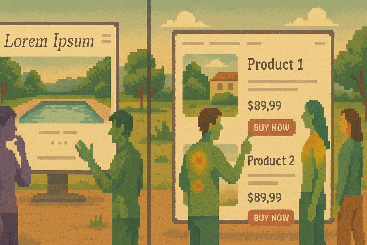
I was working with an e-commerce client selling luxury swimwear who had invested heavily in creating what they thought was the perfect website. The design was absolutely stunning - elegant, minimalist, with beautiful photography of models wearing their swimsuits. It looked like something that would win design awards, with sophisticated typography and an almost gallery-like aesthetic.
But there was a fundamental problem. The website was so elegantly designed that it had stopped functioning like an e-commerce site. The buy buttons were tiny and hard to find. Prices were hidden or displayed in small, subtle text. The overall effect was like walking into a high-end restaurant where the menu has no pictures and uses elaborate descriptions that make it impossible to understand what you're actually ordering.
The founder was design-oriented and deeply proud of the aesthetic they had created. When I suggested that users might be confused about what the site was selling, they were skeptical. The photography clearly showed swimwear, the product descriptions were there - how could anyone be confused?
Instead of debating based on opinions, we decided to run user experience research through UserTesting.com. We recruited about 10 people to visit the website and simply tell us their first impressions and what they thought they would do first on the site. The instructions were straightforward: land on the homepage and share your honest reactions.
The results were more dramatic than I expected. The very first person who looked at the website said, "Oh great, I need to book a vacation!" She started looking around the site trying to figure out where to book a getaway because the beautiful pool photography and spa-like aesthetic made her think this was a luxury resort website.
That single quote was more powerful than any analytics data I could have shown. For a design-focused founder who cared deeply about aesthetics and user perception, hearing someone completely misunderstand their website's purpose was a visceral wake-up call. It wasn't about the design being bad - it was about the design being so focused on beauty that it had forgotten to communicate function.
We redesigned the site to be more functionally clear while preserving the glamorous aesthetic that made their brand special. We made buy buttons more prominent, displayed prices clearly, and added subtle but clear indicators that this was an e-commerce experience. The goal was to keep the luxury feel while ensuring no one would mistake it for anything other than a place to buy swimwear.
When we ran the user testing again after the redesign, 70-80% of people immediately understood what the website was selling and could easily navigate to purchase products. The site maintained its elegant, high-end feel but now actually functioned as the e-commerce platform it was meant to be.
The lesson was clear: beautiful design that doesn't communicate purpose is just decoration. The most important job of any website is to help users understand what they can do there, and even the most sophisticated aesthetic needs to serve that fundamental goal.
How to Conduct This Research in Ask Rally
Step 1: Define Your UX Research Goals
Start by clarifying what aspects of user experience you want to evaluate. Are you testing overall usability, specific user flows, information architecture, accessibility, or design aesthetics? Consider your key user tasks, potential pain points, and the design decisions that will most impact user success and satisfaction.
Step 2: Create Diverse User Personas
Generate AI personas that represent your full user spectrum, including different experience levels, technical sophistication, demographics, disabilities, and usage contexts. Include edge cases and underserved user types that might struggle with your current design. For comprehensive research, create 100-300 personas across different segments.
Step 3: Design Realistic User Scenarios
Create specific, goal-oriented tasks that represent real user needs. Include both primary use cases and edge scenarios. Design tasks that test critical user flows, navigation patterns, information findability, and task completion. Ensure scenarios reflect authentic motivations and constraints.
Step 4: Present Your Interface in Context
Show personas your designs, prototypes, or existing interfaces within realistic usage environments. Include device contexts, time pressures, distractions, and situational factors that might affect user performance. Use screenshots, interactive prototypes, or detailed descriptions of interface elements.
Step 5: Test Core Usability Metrics
Evaluate user experience across essential dimensions: task completion success and efficiency, navigation clarity and information findability, error prevention and recovery pathways, cognitive load and mental effort required, emotional response and user satisfaction, accessibility for users with different abilities, and learnability for first-time users. Ask personas to think aloud through their decision-making process.
Step 6: Identify Usability Barriers
Focus on moments where users get confused, frustrated, or abandon tasks. Understand what causes hesitation, where users make errors, which interface elements are misunderstood, and what alternative approaches users would expect. Look for patterns in where different user types struggle.
Step 7: Test Information Architecture
Evaluate how well users can find information and navigate your product structure. Test menu organization, search functionality, content categorization, and wayfinding elements. Understand user mental models and whether your organization matches their expectations.
Step 8: Validate Design Patterns
Test whether your interface elements communicate their intended function. Evaluate button labels, icon meanings, form layouts, visual hierarchy, and interaction patterns. Ensure design choices support rather than hinder user understanding and task completion.
Step 9: Segment Insights by User Type
Analyze how different persona segments experience your interface differently. Identify which designs work universally versus which need customization for different user types. Look for opportunities to personalize experiences or create adaptive interfaces.
Step 10: Prioritize Improvements
Use research findings to create a prioritized roadmap for UX improvements. Focus on changes that will have the biggest impact on user success rates and satisfaction. Consider both quick wins and longer-term strategic improvements to user experience.
Starter Prompt Template
Use this prompt template to get started with user experience in Ask Rally:
Stay Updated
Subscribe to our newsletter to get notified about new articles and updates.